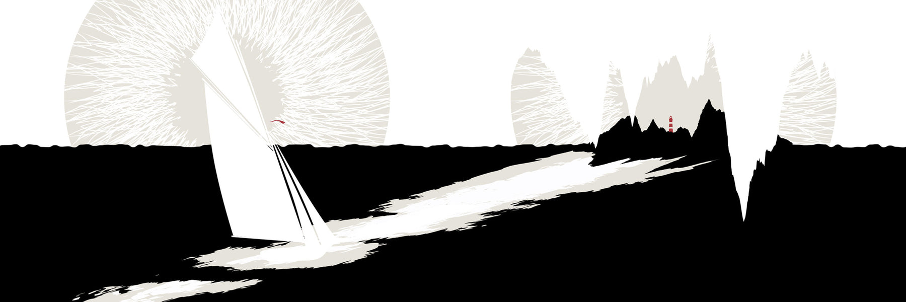
Twenty Love Poems and a Song of Despair
Pablo Neruda's collection Veinte Poemas de Amor y una Canción Desesperada is an emotional and sensual exploration of love, infatuation, and despair. Even his most sexually charged metaphors also contain an austere appreciation of beauty and nature, at once deeply personal and highly universal. In the illustration below, for example, we wanted to capture the human form as part of nature, and the universal longing of natural elements to merge together.
Neruda's work is a pleasurable, sensorial escape and perhaps the nudge we need to reconnect with each other and with nature. 
WHAT ABOUT A SPANISH EDITION?
"Have you thought about a version with the original Spanish text?" Yes! Yes we have! And you can purchase that edition here.
We collaborated with our friend, Matt Saldivar, who read an excerpt for us in Spanish.
ABOUT THE ILLUSTRATED CLASSICS
The Illustrated Classics is a series of stylishly designed pocket editions of iconic literary works. Each book is illustrated by Evan Robertson, the Cofounder and artist behind Obvious State. Thematic art, elegant typography, and exquisite language from some of our greatest minds combine for a unique, immersive reading experience that illuminates the wisdom and aesthetic beauty of beloved, enduring works. Our hope is to create beautiful, portable art objects to collect and share, and to inspire moments of quiet reflection in a hyper-connected world.
ARTIST STATEMENT
"How can artwork live on the page with poetic text in a way that enhances it without upstaging it or undermining its ability to communicate? That was my main priority, and it informed everything about the visual approach. The stark palette, the repetition of visual elements, and the balance of art and text all serve to drive the narrative forward. While there’s no “correct” way to visualize these works, I’ve chosen to focus on the broader themes rather than the literal narration of action. I wanted to create a seamless marriage of provocative visuals and punctuated language, both exploring the same idea in slightly different ways. The result, I hope, creates a uniquely illuminating and immersive experience for the reader, where the wisdom that the author and artist explore together are brought into sharper focus." - Evan Robertson
ABOUT THE FONT & TYPOGRAPHY
For this project we selected Ogg—a luscious calligraphic serif typeface designed by Lucas Sharp. The design was inspired by the iconic hand lettering of twentieth century book designer and calligrapher Oscar Ogg. It captures the unique mix of calligraphic and typographic forms he achieved through his use of hand carved pen nibs. While Ogg is high contrast and dramatic, it remains refined and warm, which we think pairs perfectly with the art.
ABOUT THE FORMAT
When considering the format of our collection one thing was important to us: The experience. We envision readers of the books treating them as a 20-minute break in the middle of the day, something to enjoy over coffee, a non-digital start to the morning, or a respite from an exhausting news cycle.
In short: A provocative, portable art object packed with wisdom and beauty.
THE SPECS
All of our books are printed in Van Nuys, California on FSC-certified, sustainable paper made with 10% recycled content. We use soy and vegetable-based inks and uncoated paper for a beautiful, elegant finish.
- Softcover printed on lush, uncoated paper
- Premium, uncoated interior paper that takes ink beautifully and showcases the high-contrast, rich blacks
- Full color interior pages
- Dimensions: 4.5 x 6 inches
- Page count: 96


